Spaces / 6 min read /
Experiential Retail: Beyond Pop-Up Footfall
Published by XR Experience · Industry analysis
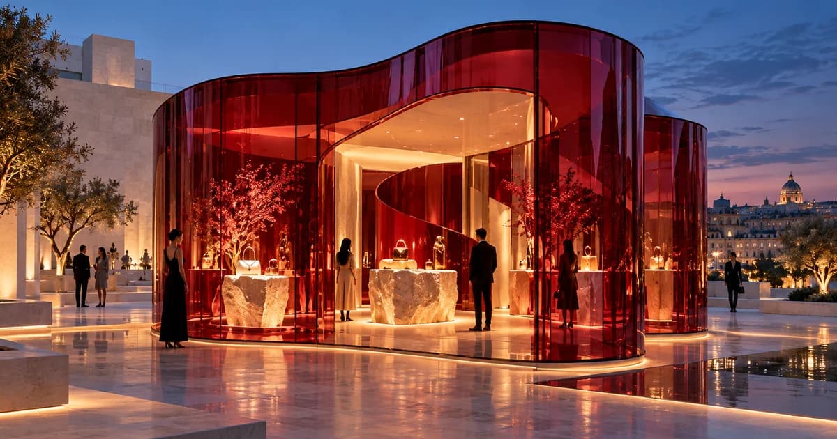
A queue outside a pop-up proves that something attracted attention. It does not explain whether visitors understood the product, found the right option or wanted to return. Experiential retail is most useful when the environment helps people make a better decision. The store can be theatrical, social and highly shareable, but those qualities need to support a reason to be there beyond taking a photograph.
What is changing in experiential retail?
Gensler's April 2026 retail analysis describes shopping centres as places for participation rather than transactions alone. Its current retail outlook also points to stores acting as cultural destinations. The useful implication for a pop-up is to define the experience people cannot get from the brand's digital channels, then design around that difference.
That difference can be modest but meaningful. A visitor can feel the weight of a product, compare finishes under consistent light or ask a knowledgeable host about an unfamiliar feature. A community-led brand might offer a workshop. A destination might create a place to pause and meet. None of these needs to become an oversized attraction to be valuable.
Start by separating the commercial objective from the visitor's task. The brand may want awareness, product trial, sales or appointments. The visitor may want confidence, advice or a pleasant discovery. A good retail concept allows both objectives to coexist. If the space makes people perform a long promotional ritual before receiving any value, the balance is probably wrong.
The brief should also identify who is not the target visitor. A broad visual spectacle can draw a crowd that has little interest in the proposition. That is not automatically a problem for an awareness campaign, but it matters for a consultation-led launch. Define the audience before treating a large footfall figure as proof that the design worked.
How should a pop-up store guide product discovery?
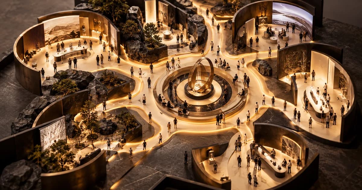
Make the first decision obvious: where to begin. A clear focal point, a visible host and one understandable invitation can do more than a wall of instructions. Visitors should be able to orient themselves without being pushed into a sales conversation. Design a short route for the curious passer-by and a deeper route for someone ready to explore.
Place comparisons where they can be understood. If the difference is texture, make samples accessible. If it is performance, create a fair demonstration with clear conditions. If it is fit, provide the space and privacy needed to assess it. Decorative storytelling should not obscure the practical reason a customer came to see the product in person.
Our suggested design test is a silent walkthrough. Ask someone unfamiliar with the concept to enter without an explanation from the team. Observe where they look, what they touch and when they hesitate. Then ask them to describe the offer. This exercise is a proposed planning method, not a claim of tested results. Its value is in exposing assumptions hidden inside the design presentation.
Give staff a usable environment too. Storage, replenishment, cleaning and a place for private questions influence the quality of the encounter. Hosts who must leave the floor to locate every sample cannot sustain a fluid conversation. Include those needs in branded space design, alongside the visitor-facing surfaces and lighting.
The digital handoff should continue the visit
Use digital tools to preserve useful context, not to create another task. A visitor who explored a particular product should reach information about that product, rather than a generic homepage. A follow-up should connect with what was discussed and be sent only through an appropriate permission-based process. The physical and digital experiences should agree on what was promised.
A QR code is a route, not a strategy. Test the destination on real phones and an ordinary mobile connection. Check readability, loading time, language, product availability and the next action. If the visitor needs to install an app before receiving a small piece of information, consider whether a simpler web experience would better serve the brief.
Avoid making every interaction dependent on connectivity. Printed product details, trained hosts and a clear manual process can preserve the value of a visit when systems are unavailable. For appointments or purchases, tell visitors accurately what can be completed on site and what needs follow-up. Uncertainty at the final step can undo a carefully designed first impression.
Personalisation can help when it reflects an explicit interest, but it does not require hidden tracking. Let guests choose what they want to save or explore next. For more complex adaptive interactions, read AI brand activations with purpose. The same rule applies: the technology should reduce the effort required to find something relevant.
Which retail metrics are more useful than footfall?
Measure progression through the intended journey. Depending on the brief, that may mean product trials, completed demonstrations, consultations, qualified enquiries or purchases. Footfall provides context for those actions, but it cannot replace them. Agree what counts as a visitor and what counts as engagement before comparing the results across days or locations.
Dwell time needs interpretation. A longer visit might reflect genuine interest, a queue, slow service or confusing navigation. Observe the cause before celebrating the number. Pair timing with a simple account of what visitors actually did. The same caution applies to social sharing: a visually popular moment may or may not communicate the intended product story.
Build learning into the operating plan. Have hosts record recurring questions and moments where visitors lose interest. Review whether signage, product placement or staffing can be adjusted safely during the run. A temporary store offers a useful opportunity to learn, but only if someone owns the process of collecting and acting on those observations.
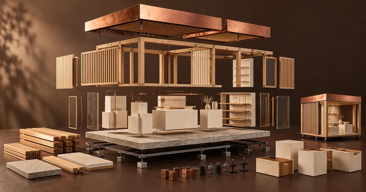
Finally, plan what happens after the tenancy. Keep reusable displays, document useful customer questions and identify the elements worth repeating. Sustainable event design offers a practical framework for retaining the physical investment. Start the next retail activation brief with those lessons, not simply a request for a bigger opening-day queue.
Before committing to the space, build a complete pop-up shop budget. Separate deposits, inventory, fabrication and operating costs, then include removal and storage. A break-even scenario can test the commercial assumptions without confusing opening-day revenue with profit.
Frequently asked questions
What is the difference between a pop-up and experiential retail?
+
A pop-up is a temporary retail format. Experiential retail describes an approach that gives visitors meaningful activities or interactions around a brand. A temporary store can use that approach, but so can a permanent showroom. The important distinction is what the visitor can do, not how long the space operates.
How can a small pop-up feel distinctive?
+
Focus on one recognisable idea and a clear product interaction. Use light, materials and hosting to support it rather than filling every surface. Protect space for circulation and staff operations. A smaller environment with an understandable offer can be more convincing than a crowded one with many competing messages.
Is longer dwell time always a good retail result?
+
No. Time spent trying products or speaking with a host differs from time spent waiting or searching for help. Look at behaviour alongside duration, and connect the measure with the campaign objective. The aim is a worthwhile visit, not simply keeping someone inside the space for longer.
experiential retailpop-up store designretail brand activationbranded spaces
Editorial note: research is linked where cited. Recommendations are planning guidance, not reported XR client outcomes. International findings are not presented as Egypt-specific market data.
Explore branded spaces & fit-outs